Hey Jeff:
The office is done (Hooray!), the carpet comes on Monday and we can start moving stuff back in.
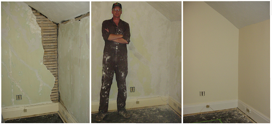
Here's a series of photos of just the one corner. Not all the corners were this bad, but every wall needed plaster repairs. At first I got more plaster on the floor and in the garbage than on the walls. As you can see, I like to keep a rag handy by wearing it.
Dave's comments are in bold. I believe it's just here at the beginning and then some more at the end.
Best wishes,
Gerhard
As I am typing this, Ger is finishing up the renovation of the A-V
office next door which he began in mid-April hoping (ha-ha) that he would be done before he and Rose left on
their vacation to Rose’s sister in Arizona at the end of April. Needless to say he is as thorough about
renovation as he is in doing backgrounds, sanding down the chipping and flaking
paint flush with the wall, pulling off all the cracked and water damaged
plaster, sanding down the more excessive swirls and finishes on the ceiling,
teaching himself to plaster in the classical manner, layer by layer, letting
each layer dry thoroughly before adding the next one, then topping up and
sanding back down flush with the wall.
He put a coat of primer on the walls
and ceiling and then a first coat of paint and then a second coat of
paint. Monday, the carpet guy is coming
in to lay new wall-to-wall industrial carpet and then we’re getting some sort
of area rug at Wal-Mart so that if it gets stained with photocopier toner or
coffee spills or whatever, we can just throw it out. That sort of price range.
The office has been temporarily moved into Ger’s office along with most
of the heavy furniture from the main office so we’ve both been working in a
much smaller space for a month and a half.
Tuesday or Wednesday of next week, that should all come to an end and we
can start filling the office with the sort of material we need in the
post-issue 300 phase of things.
All of the ensuing is extremely technical and well over my head,
but reading between the lines, everyone seems to be “on the same page”. I would agree that the higher the resolution
in the initial scanning the better for the reason stated—you can do lesser
scans from better ones but you can’t do better scans from lesser ones. Also, there is presumably a hockey stick
curve of resolution as the technology develops way up ahead where all screens
are liquid crystal and what is thought of as high definition in 2005 will be
thought of as standard in [whatever year].
Of course at that point the scanning technology will have been
stream-lined as well and a dedicated individual could probably re-scan most of
the material in a day or two that is going to take Margaret months if not years
to input. But this fish is a spoiled
brat from the head down. I want the scanned
Archive NOW, Margaret wants the scanned Archive NOW, the Cerebus readers want
the scanned Archive NOW.
I’m just glad that our spoiled brattiness is coupled with a strong
work ethic.
Dan P: I have a feeling I'm trying to pull the cart before the
horse. It will be hard to evaulate any software package without defining
exactly what the archive should be able to do (along with the
specifications for the data, like format, resolution, metadata, etc.). Is it worth starting a new thread to discuss this?
Margaret:
And I thought it was, so I started discussion on the CFG forum:
http://cerebusfangirl.com/phpbb2/viewtopic.php?p=361#361
my response:
We have two different types of data: pictures (notebooks, prelim art, etc) and
text correspondence, essays, etc).
For pictures, it should be something that quick to download, but at the same
time, at a high enough resolution to be legible. The format should be something
recognized by the majority of picture views, such as jpg, gif, tif, etc.
For text, I was thinking of saving them as a rich text format (rtf) via MS Word
and having the text as html on the online archive with a link for the rtf so
someone can download that and save it if they like to be printed out later on.
Any suggestions?
Jeff T:
---------
Absolutely. I would suggest a three step viewing system. First, a page (or small series of pages)
with small (100-150 pixel) thumbnails. Clicking on that will bring you to a
larger version (400-600 pixel) that could be then be scrolled through one at a
time (for a simple example, check out my band's site www.jazzbastards.org, and
click on the "photos" button). On each of the individual picture
pages, or at the bottom of each 1st stage thumbnail you could put a text
hyperlink to a high resolution image. Say, full size 0% compressed jpeg, or
tiff. I would avoid psd files or anything that requires special software. That
way there's viewable size pix for those on dial-up, and larger files for those
special images you want to spend the time downloading.
----------- rtf is the way to go, I think. Windows word-pad saves in this
format, so nobody would need any special software, and you can still use
special characters and formatting (italics, bold, etc.). The Monthly Q&A
files I posted to the group were done on Word Pad.
I kow
Dave said he's not into talking Cerebus Legacy Policy stuff at SPACE, but that
doesn't mean that *we* shouldn't do it. I guess it could just happen naturally
between beers and homemade sausage, and I know this will come off in part as
all structurey/beaurocraticy/etc...but do we want to talk in advance about some
kind of an agenda for what we may want to talk about at SPACE?
(yup..I was right! ;^)
In particular, I was thinking if something needed to be researched BEFORE SPACE
- like atech thing, we should bring it up now so that research could be done so
we can discuss it at SPACE.
Or not. Beer & sausage w/o Policy talk works for me too :^)
e
L nny
------------
Wouldn't it be simpler just to see what comes up when we're all together? Then,
we'll have lots of legitimate on topic items to research and discuss here in
the open!
-Jeff
I was
hoping we could have a Top Secret Cabal and plan the next 20 years fo secret
Cerebus Policy History! muahahahahahhahah!
e
L nny
I do
suggest a notepad or notebook of some kind so we can take notes if we get a
good though or two between the good eats and whatnot.
take care,
margaret, who really can't take notes after a beer or two, but perhaps she'll
do some sketches. hahahaha!
I'd see what internet discussion arises on Policy after you've all
thrown anything into the discussion
in person, then look at agendas. Other than coming up with a brief thought here
and there, you guys
shouldn't subordinate such a cool experience to scheduling agenda discussions.
chris w
Cross posted on my CFG board:
>>> dan parker wrote:
I think "future-proofing" the archive as much as possible is an
important goal. A modern monitor has a DPI of 75-100 and a 400x600 pixel scan
will look great on it. As viewing surfaces (monitors, flat screen TVs, ePaper,
whatever) improve, that 400x600 image will look like a postage stamp. I would
recommend scanning in everything at a minimum of 600 DPI. The scans can always
be batched processed into smaller sizes, but it's important to get the original
source in the highest resolution possible and saved in a lossless format. I
think JPEGs are always lousy even on the lowest compression setting, but I
wouldn't bet my life on that. A PNG is lossless, an open format (no license
fees required to write a viewer), and supported in all modern browsers. I agree
with Jeff 100% when he says that no special viewers should be necessary.
<<<<<
So far I've scanned in the first notebook's cover and the first three pages.
Just to find out what my file sizes were going to be, how reproduction of the
pages via a standard laserjet printer would look, and to get a handle on what
this is going to entail:
1. File Sizes: At 600 dpi the notebook page clocked in at 21.8 GB in PNG format
with a size of 5100 by 7020 pixels. At 150 dpi the same page was 1.5 GB in PNG
format with a size of 1275 by 1733 pixels. I've
uploaded the page here:
http://www.cerebusfangirl.com/p003at150dpi.png
2. Reproduction: On a HP LaserJet both the 600 dpi and the 150 dpi printed out
as full size reproductions of 8.5" by 11.5" with no visible loss of
clarity or resolution. Take a look at the page 3 scan posted above and let me
know how it looks to you. For now I'm going to hold off on posting the 20 GB
file.
3. Getting a grip: Most of the notebook pages seem to be text with some
sketches. The pages have content on both sides of the page, and at times the
ink from the other page is visible on the previous page. The pages are tinted
yellow a bit, and on Albatross One are starting to come off along the top of
the first few pages and cover, as they are in a spiral bound notebook.
As I start the actual scanning project this Saturday, I will start indexing the
text by picking out keywords from it or what the text relates to. I will not be
touching up the pictures electronically except to remove the border of the
blank space around the notebook page.
I am thinking of going with the 150 dpi as it gives the same clarity as the 600
dpi at a much smaller file size. I will try the other resolutions on my scanner
(200 and 300, I don't think the 100 is worth trying) to see their file size and
clarity. I could also scan everything in at 150 and 600 both and store the 600
on a hard disk while using the 150 for the online archive until I get a cable
modem and can upload the files quicker.
Dave has requested that I give each notebook a separate document number and
then just label each page with a page number. I still think the separate
document number for each page will be handy in the future, and will see if my
proposal of labelling the pages with a penciled in page number, but still
giving them each a document number, just not labelling each page it a sticker,
but rather making a note of it in the database, is okay with Dave - a good
comprise of both our ideas. This way, in case the pages fall out at a later
date, they can be stored on their own.
--
Take care,
Margaret
http://www.cerebusfangirl.com
Some general comments on the scanning.
Margaret, the image you posted is in indexed colour (PNG8) format. For
greyscale images this will have the same level of tonal detail as PNG24 (which
would be about 25% larger files), but the raises repro issues. Indexed palettes
need to be converted to the output method, and while this can be reliably
trusted for on-screen output, it can't for print output. Ideally for print output the images should
be in CMYK colourspace, but this causes
problems for on-screen display. 24-bit RGB is a common compromise, but still
needs to go through an RGB-CMYK conversion stage for print, although this is
more likely to be handled automatically.
Resolution - again, this is an issue of different requirements for different
purposes. For on-screen displays, the ideal is 72 DPI. The standard resolution
for print output is 300 DPI. I think it would be a real mistake to go lower
than this - the purpose is archival preservation, after all, and the aim should
be to preserve as much as possible, not save space. The 600DPI target is a
suitable target for art print resolutions, and would
be ideal.
My inclination would be to have everything scanned at 600DPI in 8-bits per
channel minimum for the sake of keeping ensuring the archive does as good a job
as possible of preserving the material. Stored as RGB TIFs with LZW compression
you'll have a nice, universal, decently future proof archive in a format
printing people will understand. File sizes will be large - something like 25MB
per page. That's only 188 pages on a standard single-sided DVD, or say a
phonebook per dual-sided DVD. Sizeable, but not unwieldy, and I'd have thought
a price worth paying for the sake of having a proper archive. Remember it's
always possible to sample down for smaller sizes, but you can't sample up - a
set of 72DPI PNG-8 images could be made from the full archive that would look
great on screen, and you could fit the entire oeuvre on a couple of CD-ROMs.
An additional consideration is that the image you uploaded is unprocessed. The
background white is a light grey, and very noisy. Noise compresses badly,
meaning larger file sizes. I tried cleaning the image up
sufficiently to lose the bleed-through and rules as well as the background
noise, and the same image comes out at 440kB instead of 1.46MB. You couldn't
apply as much filtration to anything with faint detail,
particularly pencil work, but it's worth noting how much of a difference that
makes.
Finally - if you place a piece of thick white paper behind the page you're
scanning, you'll get less visible bleed through when scanning thin pages.
Hope that's of some help.
Cheers,
Andrew
When I scanned it in I choosed the greyscale option, this
surprises me that it is in indexed colored.
So for black and white pages like this - greyscale will be fine? But for color
pictures (when the time arises) 24 bit RGB is the way to go?
That was what I was thinking - 600 dpi for the archive then 150 dpi resolution
for the online archive - for now. At some point in the future I would like to
see the online archive have the 600 dpi scan, and then smaller
"thumbnails" (but not all at thumbnail size).
But is a TIF a open format in that people don't need a special view to see it
in?
disk space isn't really a problem - I'm sure Dave would be willing to spot some
extra gigs when the time comes when my discs and dvds are full. I just want the
150 or 300 dpi for the website archive (for
now).
I didn't want to touch up the images because while I have done some work with
GIMP (the shareware of photoshop), my "skillz" aren't that good. tell
me specifically how you cleaned it up and prehaps I can do
it on the rest of them - or maybe once I scan them in, someone can help me with
the "clean up" so to speak?
a lot of help - i really appreciate it and any more info you can give me!
--
Take care,
Margaret
http://www.cerebusfangirl.com
The GIMP is a GNU program. The GNU project is about Free ( with
a capital F ) software, and the term
'shareware' isn't a very good way to describe their licensing stance. They mean
'free' in the sense of
liberty, not cost price.
Certainly, great free software like the GIMP can be had for no monetary cost,
but this might be regarded as somewhat of a pleasant side-effect of the GNU
GPL.
See http://www.gnu.org if you'd like to learn more about Free software and the
GNU project.
--
Regards,
Colin M. Strickland
That's a little odd. Greyscales are produced by averaging the RGB
inputs from the scanner, and as each channel in 24-bit colour is 8 bit, there
are a total of 256 possible gray scales. It's up to the software how to deal
with that, and I'd guess your scanner software is converting to an indexed
scheme with 256 greyscales to reduce file size.
I'd recommend using full colour scans even for black and white images for
archiving - standard archiving procedure. The greyscale reproduction at
scanning will produce exactly the same result as post-processing to greyscale,
so the only difference is in file size. It might seem that there's no point in
colour reproduction of black and white material, but again it's an issue of
preservation - surely it makes sense to preserve what's there as well as
possible. You never know, maybe one day someone will find it useful to have the
slight yellowing of the pages recorded too. ;-)
For black and white there's no difference between 24 bit colour and 256 colour
greyscale. 24 bit colour is made from 3 channels (red, green and blue) each
recorded at 8 bits (256 levels). As greyscale just means that the R,G and B
channels always have the same values, there are only 256 levels of grey
recorded in a 24-bit scan.
For printed material, technically speaking you'd only need 1 bit. Printing
either puts black ink down or doesn't. However the print edges will be more
accurately reproduced at anything other than an infinite resolution if there's
a greyscale component to provide averaging where a line edge occurs over a
pixel rather than at an exact pixel boundary.
The ideal would be to scan all images, whether in colour or black and white, at
the best possible resolution and colour depth. 600 dpi is a good enough
compromise. 24-bit isn't a bad compromise either, although if you want to be
really strict on accuracy, it wouldn't hurt to go for 48-bit colour depth. 16
bits per channel provides 16,535 levels per channel instead of 256, which would
be noticeable on very well reproduced subtle pencil shading, and for colour
images the greater colour depth would provide slightly improved fidelity where
there are very subtle colour transitions. However unless you're working from
originals it's really not worth the effort.
then smaller "thumbnails" (but not all at thumbnail
size).
I would drop the online archive down to 72 DPI. This will provide an image
which is pretty much life size on a typical screen (although will look
noticeably pixelated when printed out), and will mean file sizes a quarter that
of the 150 dpi. Batch processing from the main archive is not a tough task, and
if there's a need to make things better in the future then that's no real problem.
Yes. I believe it's owned by Adobe, but it's license-free. I suppose
technically they might try to rescind this at some point in the future but it
would be a pointless gesture, because the basic format is an extremely
simple pixel array with a widely documented defining header - any decent
programmer could write a decoder from scratch in no time anyway. The standard
LZW compression method most commonly used for compressed TIFs was subject to a
patent, but that expired last year. It's the industry standard for postscript
output, which is a good reason to chose it. PNG is actually a better format if
various ways, but not as well established or universally used.
72 dpi for the online archive would keep server costs way down. Server costs
are charged by bandwidth, not storage, so you pay every time it's downloaded or
viewed. At 72DPI the archive will be a more reasonable size for people to
mirror, or to be distributed as a bittorrent (or whatever the equivalent is
when this becomes relevant). At 600DPI you're probably looking at something
like $10 worth of single sided blank DVD-R discs for everything Cerebus ever.
The images will need to be in 24 bit to do any processing to them -- Image menu
> Mode > RGB on GIMP. I'm not sure if GIMP has a decent despeckle filter
(I don't use it much and I think I'm a few versions behind), but a lot of
improvement can be done with the "levels" control -- Tools menu >
colour tools > levels. This will show a tone histogram - a graph which shows
how many pixels there are at each density. If you try this for the image you
uploaded, you'll notice that there is a gap at the white end; there are no
pixels in the image with a brightness above about 243. There's a big peak in
the curve, representing the majority of pixels in the image which are light
grey background. If you slide the white arrow "input" slider down to
the foot of the curve, the image range will be compressed so that the highest
values (around 243) will be displayed as white (256). You can go even further
and move it to say the top of the curve, to push the lighter half of these
background pixels into white, which will make for a nice clean image - however
note that the further you push this, the more you're compressing the tonal
range and thus the more tonal detail you'll lose in the important image areas.
The grey and black arrows, indicating midtone and black, will slide
automatically to compensate for the decreased range, but you'll probably find
it's worth moving the midtone arrow back to the white end, to reduce the amount
of compression in the midtones. The result is that the fainter stuff fades to
white, while the relevant darker stuff retains the detail it originally had.
This process can be automated to a degree with the "auto" button,
which will automatically expand the tonal range to fill all 256 levels, but
this won't give as good a result as you'd get from hand optimising it. It's a
lot more practical if you want to put together a script to automate
post-processing of a batch of files though. However it would be a very good
idea to play with your scanner settings before you do this, as any
compression of the tonal range you do in post-processing means a lower tonal
range available for the accurate reproduction of the original. Try increasing
the contrast and gamma slightly in the scan manager, and the in GIMP check the
Dialogues menu > histogram to see the spread of tones in the image - the
graph should cover all the way from black to white, with a sharp peak near
white for the background and a second peak closer to the black end for the
foreground, which will be sharper the less tonal range there is in the
foreground material (printed matter should have a fairly sharp peak, pencils or
thin inks will have a very broad hump).
As you might have guessed, repro and image processing is my thing. Any help or
advice you need, just ask.
Cheers,
Andrew
> Cross posted to the CFG Forum also:
>
> This is a scan of Dave's Report to the Newsgroup: "Canonical"
Vs.
> "Non-Canonical". All images are approximately 900 bytes:
>
> http://www.cerebusfangirl.com/artists/canon1.png
> http://www.cerebusfangirl.com/artists/canon2.png
> http://www.cerebusfangirl.com/artists/canon3.png
> http://www.cerebusfangirl.com/artists/canon4.png
>
> At which time the word document is posted, I'll add a link to that on
> the website also. I just thought it'd be fun to kick off some
> discussion on this report.
> --
> Take care,
> Margaret
> http://www.cerebusfangirl.com
-------- Ack! You beat me to it. Here's my text version. Also, now posted in
the Files section > Monthly Q&A > Archive Report 3.5
-------- I'll try to get started on a database tonight. Found a couple of
"iconic" stories I forgot originally.
-------- Oh boy ;^D
-Jeff
> On 4/24/05, Jeff Tundis <jctundis@c...> wrote:
> >
> >
> > ---------- Just finished creating a database for Cerebus
"Canonical" vs. "Non-Canonical" discussion. PLEASE read
Dave's Archive Report 3.5 (SPACE Edition) before trying to make sense of the
database. The report is posted as text in the messages, and also as an .rtf
file in the "Files" section in the "Monthly Q&A"
folder.
> >
> > ---------- It's 6:49 AM, I've been up all night doing this. I'm going
to bed dammit! You can start the debate without me!
>
--------- OK. At the behest of L nny, I added date of publication, and
chronological order (which seems to be working fine by selecting it at the
top), as well as a few other small corrections.
--------- I've changed the title of this post to include POLICY to encourage
any discussion (if there is any). I'll be sending a version of this to Dave
next time I send a Policy email. Around the same time L nny sends the next
Q&A batch of questions.
-Jeff
For those that don't know what Jeff is talking about go here:
http://groups.yahoo.com/group/cerebus/database
and click on the link at the bottom entitled "Cerebus Miscellany"
where Jeff has put up a list of the stories that Cerebus (or Cerebus
characters) have appeared in and if they are "canonical", iconic, or
high iconic.
I had a question about the "Celebrate Diversity sampler catalog" as I
hadn't seen it before until you showed it to me. BTW - do ya think I could get
a scan of that to put on the site - prehaps some info for the checklist?
I also was wondering about putting The Challenge as canon. Since the issues
don't reference this story, as far as I can remember at least, and this story
doesn't reference anything in the story - it should be iconic as we don't know
when it happened. It happened before issue #1 I know, but I don't think that
alone should make it canon. Any thoughts any one? (for those that haven't seen
the story The Challenge, Jeff has uploaded to the files section of the group).
--
Take care,
Margaret
http://www.cerebusfangirl.com
> I agree..I also think there were some other stories Jeff had
as canonical which under Dave's
definition should be iconic...some of the Swords shorts?
> e
> L nny
------- Certainly up for debate. I thought some of Dave's
definitions were in conflict with each other, and along with other info I've
gathered since, it's where I thought those stories fell in the hierarchy. Up to
Dave in the end, of course. This is sort of a "first draft."
-Jeff
> I'm a tad confused.
>
> Everything is gonna be collected right?
>
> We're just discussing how it all gets collected?
>
> Matt
More like how we will perceive what's collected. Plus, I don't
think EVERYTHING will make it into the Miscellany book (it would be wonderful
if it did, but..)
e
L nny
Well, everything that's black and white that Dave has the right to
reprint SHOULD make it in there.
And maybe a second Color volume.
Matt
Preaching to the choir. I don't recall if Dave has addressed this
issue..has he?
e
L nny
AND HERE'S A TEXT VERSION OF THE DATABASE: (please not, this is
much easier to view online. You can also sort by category, or chronological
order, etc. After which, hit "printable report" at the top of the
page, print it out for Dave!)
"Category", "Title", "Publication Date
& Where It Appeared", "Placement", "Notes",
"More Notes", "Chronological Order"
"Iconic\, High", "Arnold the Isshurian",
"(1983/02) Epic Illustrated 16", "n/a", "A parody of
the Chronicles of Nemedia\, substituting Arnold for Conan. No story relevance.
Although the story takes place in Estarcion\, it is an alternate Estarcion
where Arnold conquers Serrea\, Palnu and Iest.", "", "-580
BZ"
AGREED – Dave Sim. [Dissenting viewpoint
– it should still be included in the Miscellany Volume with the qualifier that
it is divorced from the back story of the Arnold the Isshurian who appeared in High
Society but should be referenced in a
footnote on the first page where Arnold appears in the High Society volume]
"Canon", "Selling Insurance", "(1985/06)
Epic Illustrated 30", "pre-issue 1", "While there is no way
to pin-point where the story goes on the timeline because it takes place prior
to issue 1\, it is relevant to both character and theme. Chronologically\, it
comes third. Cerebus is 8 years old (1393).", "Color. May need to be
printed in a seperate volume\, or perhaps in the middle as a color insert/supplement.",
"1393"
AGREED – Dave Sim [Definitely needs to be printed in a
separate volume as does all of the colour work. There is no way that you could
bind the texture of paper required to reproduce colour accurately with the
white newsprint of the trade paperbacks and not have it look really, really
strange or increase the binding problems unnecessarily.]
"Canon", "The
Girl Next Door", "(1985/06) Epic Illustrated 30",
"pre-issue 1", "While there is no way to pin-point where the
story goes on the timeline because it takes place prior to issue 1\, it is
relevant to both character and theme. Chronologically\, it comes first. Cerebus
is 5 years old (1390).", "Color. May need to be printed in a separate
volume\, or perhaps in the middle as a color insert/supplement.",
"1390"
AGREED – Dave Sim [would need to be footnoted in the scene in Form
& Void where Cerebus races past the
same house]
"Canon", "A Friendly Reminder",
"(1985/02) Epic Illustrated 28", "pre-issue 1", "While
there is no way to pin-point where the story goes on the timeline because it
takes place prior to issue 1\, it is relevant to both character and theme. Most
likely set in 1403\, while Cerebus was living with Michelle.",
"Color. May need to be printed in a separate volume\, or perhaps in the
middle as a color insert/supplement.", "1403.1"
AGREED – Dave Sim [would need to be cross-referenced with the
‘Breaking Up is Hard to Do Story” and the back cover of one of the issues of
the Cerebus Fan Club newsletter that depicted the original Michelle and
footnoted in “The Countess & The Aardvark”]
"Canon", "Silverspoon", "(1980) The
Buyer's Guide for Comic Fandom (bi-weekly starting in issue 317) \, World Tour
Book\, Swords of Cerebus 4\, Cerebus Bi-Weekly Special\, current printing of
Cerebus Volume 1.", "between issue 13 and 14", "Although
currently printed in the first volume\, it should be included in the
miscellany.", "", "1412.5"
DISAGREE – Dave Sim [I think it needs to be a firm policy that
there’s no duplication of the material from the Cerebus trades into the
Miscellany Volume. I think it’s home to
stay in the Cerebus volume because otherwise the sudden appearance of Lord
Julius is inexplicable in the narrative]
"Canon", "What Happened Between Issues Twenty &
Twenty-One", "(1981/Fall) Swords of Cerebus 3\, World Tour
Book", "between issues 20 and 21", "", "Inked by
Gene Day.", "1413"
AGREE – Dave Sim [Only in the Miscellany Volume with a
footnote at the end of the last page of the issue 20 story in the Cerebus volume and an explanation in the MV that the
point of the story was that the answer to the question only posed more
questions and made things more instead of less confusing]
"Iconic", "Cerebus Dreams",
"(1983/Summer) Swords of Cerebus 3\, World Tour Book", "circa
issue 6 (?)", "Fall of 1411 <per Alexx>", "By Barry
Windsor-Smith", "1411.4"
DISAGREE – Dave Sim My choice
to incorporate “Cerebus Dreams” into the storyline means that it began as
Iconic but became Canonical. Miscellany Volume with footnote on
whatever page the first significant post-BWS dream occurs—probably the extended
sequence at the beginning of Church & State volume 2.
"Canon", "Cerebus Dreams II", "(1984/12)
A-V in 3-D", "circa issue 67 (?)", "Night of June 29-30\,
1414. Described in CS1 p.314. <per Alexx>", "Printed in
red/blue 3-D. Color. May need to be printed in a seperate volume\, or perhaps
in the middle as a color insert/supplement.", "1414.2"
DISAGREE – Dave Sim Agree on
the Canon designation but disagree on the 3D.
Should be footnoted or annotated in the Miscellany Volume that it
originally appeared as a 3D story but enters the Canon as a black & white
story and footnoted in Church & State
II on the same page as the footnote for BWS’s “Cerebus Dreams”
"Iconic", "The Morning After", "(1981/06)
Swords of Cerebus 2\, World Tour Book", "n/a", "1412
<per Alexx>", "Inked by Joe Rubenstein.",
"1412.3"
"Iconic", "A Night on the Town",
"(1984/Fall) Swords of Cerebus 5\, World Tour Book", "circa
issue 6 (?)", "Winter 1411 <per Alexx>", "",
"1411.5"
I begin to share the perception
at this point that my designations aren’t specific enough. Are
these stories Iconic? By the definition
that they make no reference to the rest of the story, they’re Iconic but
certainly at the time that I did them, I intended them as supplemental stories
to the formal storyline. Cerebus got
drunk a lot so there are a lot of “Untold Stories of the Drunken Cerebus”. These are two of them that did get told in
an effort to restore the balance. I
intended the Iconic designation more for the Miami Mice and normalman appearances
which puts these in a separate category, but what’s a good name for that
category? Maybe Non-specific Canon with
Alexx’s date appended to it i.e. NS Canon [1411.5]. The NS Canon designation would indicate that it’s considered part
of the storyline but its correct placement is an open question. If anyone wants to play Sherlock Holmes,
they’re welcome to do so. It’s 1411.5
until someone mounts a persuasive case as to why it would have to be no later
than 1408.3 and no earlier than 1405.5.
Since there is no example of that yet, we have time to figure out how
that would be handled. If there’s only
one date then it’s Alexx’s if there’s more than one date, the first one is
Alexx’s and the following ones are the dissenting viewpoints in order of
appearance with a two letter code indicating the source. “NS Canon [1411.5 AX; 1408 SB;
1407 DP]” with the understanding
that if Alexx can be persuaded of the argument then the designation would
change to “NS Canon [1408 SB]”. Again,
all designations are assumed to be Alexx unless otherwise noted.
"Canon", "Magiking", "(1978/11) Swords of
Cerebus 4\, World Tour Book", "between issues 12 and 13",
"", "", "1412.4"
AGREED – Dave Sim [Miscellany
Volume with appropriate footnote in Cerebus
Volume]
"Canon", "His First Fifth", "(1984/10)
Epic Illustrated 26", "pre-issue 1", "While there is no way
to pin-point where the story goes on the timeline because it takes place prior
to issue 1\, it is relevant to both character and theme. Chronologically\, it
comes second. Cerebus is six years old (1391).", "Color. May need to
be printed in a separate volume\, or perhaps in the middle as a color
insert/supplement.", "1391"
AGREED – Ditto colour story
reference above
"Canon", "The Name of the Game is
Diamondback", "(1981/01) Swords of Cerebus 1\, World Tour Book",
"between issues 12 and 13 (more accurately\, in the middle of page 244 of
Volume 1 <per Dave>)", "", "",
"1412.1"
AGREED – Dave Sim [MV with
footnote CV]
"Canon", "Passage", "(1982/4-6) Cerebus
the Newsletter 6\, Following Cerebus 2", "between issues 3 and
4", "", "", "1411.1"
AGREED – Dave Sim [MV with
footnote CV]
"Canon", "Demonhorn", "(1978/07) Nucleus
1\, Swords of Cerebus 2", "between issues 4 and 5",
"", "", "1411.2"
AGREED – Dave Sim [MV with
footnote CV]
"Iconic", "Breaking Up Is Hard To Do",
"(1986/10) Anything Goes 3", "n/a", "Circa 1403-1414
<per Alexx>", "", "1403.2"
AGREED – Dave Sim [MV with
footnote HS]
"Iconic", "A Well-Equipped Bar", "(1983)
The Animated Cerebus", "n/a", "Circa 1404-1411 <per
Alexx>", "Color. May need to be printed in a separate volume\, or
perhaps in the middle as a color insert/supplement. Perhaps for the Animated
pages\, they could be reduced and all frames can form a sequence\, 1 per page.
", "1404.2"
DISAGREE – Dave Sim [NS
Canon]. Would definitely need to be
reproduced in a colour volume. The idea
of repasting it into comic page format is interesting. Because the original films were accidentally
destroyed through improper storage, it’s impossible to reproduce the actual portfolio as constituted—either as a portfolio
or as individual pages in a colour volume.
However the original tracing paper overlays and original backgrounds
still exist so it would be possible to reconstruct
the images pretty accurately through photoshop and other computer
innovations. Of course, when I consider
how much time it would take to do that—even with all the computer advances—I
become tempted to redo the three backgrounds or get Gerhard to redo them and
produce a better visual package for that reason. My instinct tells me that once you are reconstructing, rather than reproducing
you have entered a different category and all bets are off. Once you’re reconstructing the images,
you’re free to reconstruct the backgrounds as well. The other extreme of that is faithfulness to the original
product. That is, it is preferable to
have a second rate reproduction of the original portfolio in the colour volume
(i.e. shot directly from a printed copy) than to have a first rate reconstruction
of the original (re-done using the original inked overlay drawings) and it is
preferable to have a first rate reconstruction than to having a reconstruction
which includes redrawn and repainted backgrounds. Is it sufficient to have one page showing—through a photograph of
the original portfolio with a few of the plates—what the original portfolio
looked like and then do a comic page format using the original overlays, but
also redrawn backgrounds more suited to a colour volume? Even assuming Erik Larsen is still
interested in doing it, it isn’t going to happen, like, tomorrow, so I’d
welcome any guidance as to what level of faithfulness is required here.
"Iconic", "His First Sword", "(1983) The
Animated Cerebus", "n/a", "Circa 1404-1411 <per Alexx>",
"Color. May need to be printed in a seperate volume\, or perhaps in the
middle as a color insert/supplement. Perhaps for the Animated pages\, they
could be reduced and all frames can form a sequence\, 1 per page. ",
"1404.1"
DISAGREE – Dave Sim - Canon
This was how he got his first sword, unlike his more famous later sword.
"Canon", "Add One Mummified Bat", "(1983)
The Animated Cerebus", "pre-issue 1", "Only appearance of
Magus Doran. <canon per Dave>
Most likely takes place between 1394-1397.", "Color. May need to be
printed in a seperate volume\, or perhaps in the middle as a color
insert/supplement. Perhaps for the Animated pages\, they could be reduced and
all frames can form a sequence\, 1 per page. ", "1394.2"
Because of improper storage, the negatives for the Animated Portfolio were
destroyed some years ago. Because the
original backgrounds and the original “cels” (actually ink drawings on tracing
paper) still exist it is possible to reconstruct the images. Of course reconstruction is different from
reproduction and that enters areas of faithfulness to the original
material. Which is better: reproducing
the original portfolio from a printed copy and accepting the loss of image
quality by doing a copy of a copy or reconstruct the images matches colours via
Photoshop and other modern conveniences?
Is it preferable, in the proposed colour volume to just shoot a photo of
the original envelope with the 45 plates fanned out and then print the stories
in a reconfigured comic-page format (three tiers of two ‘cels’ each) or do we
stick with the original format and just reduce it a lot? There does seem to be an impulse on my part
to start wanting to redo the backgrounds if the format is being changed that
drastically. Where does reconstruction
stop if you lose the one image per page format? I’m open to any kind of input since I don’t think the colour
volume—even if Erik Larsen is working on it with Bob Chapman as I’m typing
this—is going to happen, like, tomorrow, so there is time to discuss these things.
"Iconic", "Teenage Mutant Ninja Turtles 8",
"(1986) Teenage Mutant Ninja Turtles 8", "n/a", "The
year is 1406.", "", "1406"
DISAGREE potentially – Dave Sim
– I had forgotten the 1406 reference in Kevin’s script if that’s what you’re
quoting. If it’s in there, that would
put it in the same category as “Cerebus Dreams” high iconic but capable of
being transferred to Canon or NS Canon after the fact depending on the fit. Is
there anything about 1406 that would disqualify it? If not, it could be incorporated in the MV depending on how Pete
Laird felt about it or at least designated as Canon with an appropriate
footnote.
"Iconic\, High", "Crossing Over",
"(1993/05) Spawn 10", "n/a", "Art by Todd
McFarlane.", "Color. May need to be printed in a seperate volume\, or
perhaps in the middle as a color insert/supplement.", "N/A"
AGREED – Dave Sim – could be
incorporated into a colour volume more easily for obvious reasons if Image is
doing the book and could be incorporated, regardless, depending on how Todd
feels about it.
"Iconic\, High", "Requiem for the Mice",
"(1987) Miami Mice 4", "n/a", "", "",
"N/A"
AGREED – Dave Sim
"Iconic", "The Applicant", "(1986/10)
Cerebus 91", "n/a", "Circa 1404-1411 <per
Alexx>", "Jam with Colleen Doran", "1404.3"
DISAGREE – Dave Sim – Bear’s
appearance in the story makes it Canon.
As Alexx says it can’t be narrowed down any further than 1404-1411 but
it’s still Canon. MV
"Iconic\, High", "Celebrate Diversity catalog
recap", "(1994/10) Celebrate Diversity sampler catalog",
"n/a", "A one page re-cap of Cerebus featuring new art by
Dave.", "Launching pad for the still ongoing \"Untitled\"
jam story with Chester Brown.", "N/A"
AGREE – Dave Sim – don’t
remember doing this, at all.
"Canon", "Squinteye the Sailor",
"(1985/04) Cerebus Jam 1", "pre-issue 1", "While there
is no way to pin-point where the story goes on the timeline because it takes
place prior to issue 1\, it is relevant to both character and theme.
Chronologically\, it comes fourth. Cerebus is 9 years old (1394).",
"Jam with Terry Austin", "1394.1"
Agreed – needs to be footnoted
at Squinteye’s “appearance” at the beginning of GUYS MV
"Iconic", "Cerebus versus The Spirit",
"(1985/04) Cerebus Jam 1", "circa issue 6 (?)",
"1411\, narrated from 1416 <per Alexx>", "Jam with Will
Eisner", "1411.3"
Disagree – Canon owing to
reference to Garrison and “I first met the Pope”
"Canon", "The Defense of Fort Columbia",
"(1985/04) Cerebus Jam 1", "pre-issue 1", "Takes place
in the Tcapmin Kingdoms\, 1402 <per Dave>.", "Jam with Scott
& Bo Hampton.", "1402"
Agree – Dave Sim MV
"Canon", "The First Invention of Armour",
"(1985/04) Cerebus Jam 1", "pre-issue 1", "Takes place
in 1404 <per Dave>.", "Jam with Murphy Anderson",
"1404.4"
Agree – Dave Sim MV
"Iconic\, High", "The Face on the Bar-Room
Floor", "(1995/05) Bacchus 1", "n/a", "",
"Crossover/Jam with Eddie Campbell", "N/A"
Agree – Dave Sim
Iconic\, High", "Normalman for President",
"(1985/08) Normalman 10", "n/a", "",
"Crossover/Jam with Jim Valentino", "N/A"
Agree – Dave Sim
"Iconic", "Elfguest", "(1983/07) Cerebus
52\, Bi-Weekly: Church and State 2", "n/a", "Happens
outside continuity. Dream sequence/Cross-over. (1412 <per Alexx>)",
"Features characters from Elfquest.", "1412.2"
Disagree – Dave Sim – High
iconic. The actual significance is the
relationship between Cerebus and Elfquest as intellectual properties.
"Canon", "Like-A-Looks", "(1990/08-09)
Cerebus 137\, 138", "Issues 137\, 138", "Automatically
canon. Listed only for inclusion in Miscellany.", "",
"1415.2"
AGREE – Dave Sim – needs a
footnote at appropriate place in Jaka’s
Story Oscar/’Aunt Victoria” sequence
MV
"Canon", "Square One", "(1988/07-08)
Cerebus 112/113", "Issue 112/113", "Automatically canon.
Listed only for inclusion in Miscellany.", "",
"1415.1"
AGREE – Dave Sim – needs a
footnote at the beginning of Jaka’s Story
and the end of Church & State MV
"Canon",
"Exodus", "(1983/06) Cerebus 51", "Issue 51",
"Automatically canon. Listed only for inclusion in Miscellany.",
"", "1414.1"
AGREE – Dave Sim – needs
footnote at the beginning of Church &
State and the end of High Society MV
"Canon", "The Challenge", "(1992/08)
Comics Buyers Guide 977", "pre-issue 1", "Not quite sure
about this. I've a feeling Dave may know where this fits in. According to Alexx
Kay's timeline\, this most likely takes place in 1410 following the 5-day
Eshnospur rebellion.", "", "1410"
AGREE - Dave Sim – the exact location I don’t know
specifically although I did at one time.
Since it was intended for the Captain
Canuck Summer Annual (somewhere between 1980 and 82) I had Cerebus do a
quick southerly dip into one of the southern city states for a summer climate
backdrop (everyone is sweating like pigs) either between the time he left
Serrea (issue 4) and crossed the Red Marches (issue 5) or between the time that
he crossed the Red Marches and before he entered Iest (issue 6). I might be misremembering but I think that’s
how it went. MV
"Canon",
"An Untold Tale of the Secret Sacred Wars", "(1988/10) AARGH!
1", "between issues 79 and 80 <per Alexx>", "",
"", "1414.3"
AGREE – Dave Sim – needs to be
footnoted at the appropriate place in Church
& State volume two. MV